Friday, June 29, 2012

Sweet Sunday Sketch Challenge #3


All right...I managed to get one more entry ready for the Sweet Sunday Sketch Challenge DT call!  Phew!  For this, my third entry, I decided to turn the sketch on its side and change up the size as well.  This card measures 5 x 5 inches. 

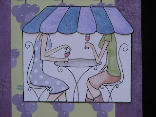
I haven't used any of my Bella stamps in quite some time, so I dusted them off and chose this one to make a card for a dear friend.  She needs a little pick me up right now, so I wanted to send her a card to let her know that even though she is far away, she is always in my thoughts!  I love this stamp, because my friend has crazy curly hair, and my hair is straight.  Rather appropriate, don't you think?  :)


I resorted to my stand-by SU! designer papers and coordinating cardstock.  That way not too much thought is required!  Everything matches up, easy-peasy-lemon-squeezy!  I decided to do some machine stitching on this entry too, since it is something that I didn't do on either of my other two cards.


Here is a close up of me and my friend *wink* who were colored with Copics.  I always find the mouths and the arms a bit of a challenge when coloring Bella stamps.  What color should their mouths be?  And they don't really have any arms....  In the end, I am happy with how 'we' look, so I guess that is what is important!


I did take a couple of minutes to finish off the inside of this card.  I am caving in to the pressure that all of you out there are putting on me because you finish off the insides of your cards so beautifully!

Well, there you have it!  My third (and final) entry for the Sweet Sunday Sketch Challenge!


Sweet Sunday Sketch Challenge #2


When I 'heard' about the Sweet Sunday Sketch Challenge, I decided that I would like to give it a shot.  The rules say that you can enter more than one time, so I can only improve my odds if I do, right?

On that note, here is my second submission for the challenge!  I am traveling back to Canada next week, to attend my new niece's baptism.  Of course, I need to bring a very cute gift, and a hand made card.  For an event like this, a store bought card just wouldn't do!

Since this is my second submission for the challenge, I also thought that I should show some different techniques than the ones I used on my first card.  This time I decided to step away from the images that need to be colored, and do some embossing instead.  I haven't embossed in AGES!  I have to say, going back to some older and lesser used tools has been a fun excercise for me.


The papers that I have used here are all from Stampin' Up, as is the cross image.  I stamped the image in Brilliance ink and then used ultra fine gold embossing powder on top.  I gave it a shot with my heat gun, and I was good to go.

The ivory background was dry embossed with a swiss dot embossing folder and my Cuttlebug and the flowers were made using Die-namics from over at MFT.


I finished off the inside of the card very simply with another gold embossed cross and the sentiment 'on your Baptism day'. 

I have to admit, I changed this card around a few times.  I had the vision of pink and black for this card, because I really wanted the contrast that those colors would provide.  I initially stamped the cross in black, but it felt too morbid.  I preferred the gold in the end, and so did my two little critics.  They think they are experts at the ripe old ages of 10 and 7!  :)


Sweet Sunday Sketch Casting Call


I 'heard' that there was a casting call for the Sweet Sunday Sketch team while I was cruising around the blogosphere, and I decided to get my butt in gear and come up with an entry.  It looks like there are A LOT of entries already, but you can't achieve something that you don't take a shot at, right?

I have really been enjoying playing with my 'a la modes' stamps from over at MFT, so I decided to use one of them for my entry.

I was fortunate enough to get to take a trip to Aruba recently, as the guest of a friend who has a time share there.  It was a fabulous vacation, and I now have some 'thank you' cards to send out.  This little lady was perfect for the task.

I used both cork and a piece of a cut up brown paper lunch bag on this card, because for me, they both evoked visions of coffee.  Fresh coffee beans in a brown paper bag....I can smell them as I sit here typing.....sigh.


The papers are all from Stampin' Up, and my stamped image was colored with Copics.  I am having more fun playing with my Copics since I took a couple of classes at CKC Cincinnati in the fall.  They now don't seem quite as intimidating! 


Here is a detail shot of my little barista.  You will also notice that my sentiment is from a different MFT set...one of the Who's That Girl sets called Hot Stuff.  It is another favorite of mine!


Wish me luck on the casting call!


Saturday, June 16, 2012

Happy Father's Day!


I got the ideas for both of these cards online.  There are dies out there that will allow you to make ribbons, banners and t-shirts.  Honestly, I don't have any of those dies, so I just winged it!  These cards were made for the two grandpas....my dad and my husband's dad for Father's Day. 

The papers are all Stampin' Up!  I like this colour palette because it is inherently masculine, without having to work hard at it.  I also liked the t-shirt idea, but I didn't think I would get enough use out of a stamp and die cut set to make it worth the outlay of cash.  I drew this shirt by hand and then cut it out and coloured it with Copic markers.  I used an old tag I had kicking around as a stencil for this tag.  The corduroy button and brad I had sitting from a LONG time ago, and are both from SU! as well.


For this second card, I used the same SU! papers.  The fish tail ribbons were cut by hand and the circles were cut out using my Nestabilities dies and my Cuttlebug.  The rest is pretty self explanatory!


Enjoy your Father's Day!

Wednesday, June 13, 2012

Prince Charming


My husband and I are gearing up to celebrate our 15th wedding anniversary this summer.  I cannot believe that it has been 15 years!  We met young, we married young, we had our kids young, and we are still crazy about each other.  I know, it's kind of sappy, isn't it? 

For Father's Day this year, I wanted to make my hubby a special card that was just from me.  The kids each made him one too, and they really did a terrific job, each taking a turn in my craft room using my supplies.  I will have to post pics of their cards too.

Anyways, this is the card that I made.  It isn't a typical 'Happy Father's Day' kind of card, but instead it was to let him know that I still think he is wonderful, even after all these years.  :)

This card was created from a sketch (MFTWSC75), although I didn't actually post the card to the MFT blog.  I will often cruise around online to find sketches, even if they are old ones, and use them to create my projects. 


These papers are all from Stampin' Up.  I have been using a lot of SU! papers lately.  I have such a stockpile of them at hand, and they are all so easily coordinated when you hoard the cardstock too, as I do!  The image is from MFT and I colored it with my Copic markers.  My little knight was colored and then cut out and popped up with some dimensionals.


I finished off the inside of the card (very simply), as is becoming the trend.  I spend so much time on the fronts of my cards, I am not always keen to finish off the inside of them too.  You crafters out there are always raising the bar though, and I figured that this card (and it's recipient) was worth the extra effort! *wink*


Monday, June 4, 2012

A Big Thank You!


This card is going to my in-laws, who came and helped my husband with the kiddies so that I could take a girls' trip to Aruba.  Yes, you read that correctly.  I went on a girls' trip to Aruba, while my husband and kids stayed at home and went to work and school.  I am a lucky girl!

I have a friend who was celebrating her 40th birthday this year, and in celebration of the big day, she was going to Aruba.  The only way we could make it work, in terms of me being able to go with her, was if Kevin were to have some help here at home.  That is where my in-laws stepped in to help out.  They came and stayed at our house for the week so that they were here to get the kids off the bus and supervise homework, snack and afterschool activities, until Kevin got home from work.

I picked up a little gifty-gift (of course!) but I needed a card to go with it.  This is what I came up with!

I used Stampin' Up! patterned papers and cardstock.  The sentiment and stamp are both from over at MFT.  The sentiment was cut out with a Spellbinders Label Nestabilitie Die and my Cuttlebug.  The image was coloured with Copic markers.  A couple of flowers, brads and a button, and I was done!


I had a terrific time in Aruba, and I am already planning my next getaway.  My husband and I will celebrate our 15th wedding anniversary with a trip to Santorini, Greece in October!  I am guessing I will be making a lot of thank you notes after that kid-free-nine-day-getaway!


Wednesday, April 4, 2012

Happy Birthday, Dude!

Well, my son has hit the double digits! I cannot believe that he is getting so grown up. We just celebrated his 10th birthday on Sunday, and this is the card that I created for him.

It may seem like a bit of an odd sentiment for your own son, but it is a bit of an inside joke. Several months ago, I noticed that whenever my son is with his friends, he refers to them all as 'dude'. I don't know why or where that tendency came from...we don't even use the word 'dude' in our house. I must admit, I found it kind of funny. So, when I saw this sentiment amongst my stamps, somehow, it just worked.


The patterned papers are from Sandy Lion. They are called Camping Trip and Solitude. The cardstock is old olive and peach parfait from SU! The sentiment is from My Favorite Things Pure Innocence Skater Boy stamp set and the dirt bike is from SU! Loads of Fun. I used Copics to colour the dirt bike and to make the dirt on which it sits. I did a bit of machine stitching and then layered it all up with pop dots.

My son really liked his card because he is really into a mini dirt bike that he got a few months ago for Christmas. Although his dirt bike isn't yellow, I chose the colour because that is a reference to joke within our family. That is the beauty of making your own cards. You can customize them just perfectly for the recipient. It just seems to make them that much more meaningful!


Friday, March 30, 2012

Saddle Up!

Howdy!

I have another 12 x 12 two page scrapbook layout for you today. This layout is about my daughter, who was four years old at the time. She has always been very into animals of all sorts, but around the age of three or four, she became obsessed with horses.

At the time, we were living in Ohio, and I set out on a mission to find someone willing to introduce a four year old to the world of horses. It turned out to be a difficult task! Many of the people who I spoke with don't begin lessons until children are about age eight. We were a few years from there! Then I met "Mr. John". He was an older man, immensely patient, very unflappable and soft spoken. He agreed to take us on!

This layout depicts one of Rebekah's first times riding. We were just giving it a try, to see how she liked it, hence the bicycle helmet instead of a proper riding helmet. The proper riding helmet came later. :)

This horse became Bekah's first love. Dream was her name, and we had to leave her behind for other children to ride when we moved out of state. We have since learned that Mr. John found her another home with a family who have two little girls just about Rebekah's age. It is good to know that she is going to be loved and that there are other little girls to take over giving her peppermints on Rebekah's behalf!


On this layout I used a paper bag that I received when I purchased something in a gift shop. I kid you not....I think I had that bag in my possession for two years before getting to this layout! I knew as soon as I saw it, that it would be perfect for a horseback riding or western themed layout and I tucked it away in my 'idea pile' where things collect until I can get to them.

I have talked before about using the world around you as inspiration for your creations, and this is a perfect example of how I put that into practice. This is also the reason why I don't scrapbook my photos in order....gasp!! I have so many friends (I am talking to you Carol and Joy!) who scrapbook chronologically. I find that if I force myself into that box, then I don't enjoy the process or the outcome nearly as much. I work on whatever inspires me at the time. Sometimes the inspiration comes from a certain patterned paper or colour combination, other times it is a photo, and other times it is a paper bag!


You can see in this photo that I did my journaling on a tag that I tucked behind one of the photos. The photo was adhered using pop dots (otherwise known as dimensionals), allowing space between the photo and the page for my tag to slide in and out.


I used horse themed stickers from Paper House Productions and Flair Designs.


Here you can see a close up of the zigzag stitch that I used to sew the paper bag to the layout. I really like sewing on both cards and scrapbook pages. I find it gives my creations a little lift!

Thanks for stopping by, and don't forget to leave me a comment so that I know you were here!


Sunday, March 25, 2012

I Love My Hemp Twine!

*I have retaken the photos with a different camera setting*
It looks like I am going to have to mess with my camera settings and retake these photos. I am not happy with how these photos have turned out at all. So, please excuse the picture quality!
This is another travel themed layout (for anyone who knows me, that is no surprise!). The photos were taken on a trip to western Canada....Alberta specifically.
I used my Cricut to cut out the 'Nature' title as well as the other two matching green elements.
I was excited to use some of the ledger paper that I picked up while at CKC Cincinnati in the fall, to create my journaling block. I added an 'O Canada' sticker to help anchor that element. I then wrapped hemp twine around one of my photos to give the layout a rustic nature-ish kind-of-feel. I really love hemp twine for this purpose. It is also great on masculine layouts and cards.

This side of the layout features my main photo. You can see that I matted the left photo twice, so
that the eye is drawn towards it as a focal point of the layout. I then added a couple of vellum quotes from a quote stack that I had kicking around, and some more hemp twine, and I was ready to go!
Stay tuned for some better photos to come.....

Tuesday, March 20, 2012

I Can Smell the Grapes....

*I've reposted the pics using a different setting on my camera*

I am just realizing as I type this post that these pictures turned out kind of stinky. Hmmm. I think a re-take may be in order!

For now, I will tell you about the layout anyways. This layout features photos of the area surrounding our home where we lived in Switzerland. Our landlord was a wine maker, who also grew and harvested his own grapes. As a result, the property was surrounded by vineyards. Since my daughter was a newborn when we moved to Switzerland, walking through those vineyards pushing a double stroller was the solution to losing my baby weight!

I used my Cricut to cut out the title and the large circle that mats the photo on the above page. A little trip to my button jar gave me the idea for the bunch of grapes on the top right of the page. I hand journaled in white gel pen around the circle to get some of the necessary details in there without a ton of journaling. I just didn't feel that much journaling was necessary on this layout.

The right hand page of my double page layout features a stamp set from My Favorite Things called Meet Me at the Cafe. I used a combination of paper piecing and coloring to fill in the image. I will try and get a better detail photo posted here soon.

I think it is safe to say that stamping on cards is far more common than stamping on scrapbook pages. Because I participate in both the craft of card making and the craft of scrapbooking, I really like to incorporate the two where I can. It can be a challenge at times, because small stamped images can get lost on a 12 x 12 layout. Personally, I like the challenge of trying to make it work, so you are sure to see some more stamping on my layouts in the future!
Stay tuned!

Saturday, February 18, 2012

Rocky Mountains

This layout gave me more Cricut practice! The photos depicted are of the Rocky Mountains in western Canada, between Calgary and Banff (in Alberta). It is really, honestly, one of the most beautiful drives I have ever seen (even after having lived in Switzerland!). I love it out west.


The day these photo were taken was a beautiful, sunny, clear, crisp day. I chose navy blue card stock for my page base because I really wanted my photos to stand out against the dark colour. The layout is quite simple, allowing the photos to be front and center. The snowflakes on the right hand page were cut using the Cricut, and then were run through my Xyron and covered with glitter (from SU!). The snowflakes on the left page are card stock stickers.


The journaling block was made using my Top Note die from SU! (yes, again). The silver ribbon is from Michaels. The letters for the title were cut using my Cricut. The patterned paper is SU! as well.


The words on the right hand side of the above page are clear stickers.

Check out those mountains....breathtaking!


Here you see my journaling up close. Yes, by hand again! As I have mentioned before, I am working on including my handwriting in my albums more. It is so much more personal than typed journaling. I know that I love finding my grandmother's or my aunt's handwriting on old recipes, now that they are no longer with us. It is a little piece of them that I still have with me. I challenge you to do the same. Let go of the need to have everything lined up and perfect, and just write!


Thursday, February 16, 2012

Silly Boy

I have been fortunate enough to attend CKC Cincinnati for the last two years running. Both years, I convinced my fun loving friend Carol, to be my partner in crime, signing us up for ridiculous numbers of classes and dragging Carol in my wake. She has been a good sport!

This layout is from one of the classes we attended together. The class was by Piggy Tales Academy and they provided all of the papers and supplies.

The photos featured are of my son, Noah. He used to be so photogenic....but as he gets older, he seems to feel more awkward in front of the camera. He gives me these forced, fake looking smiles that never really look like him. My best bet is if I can catch him unaware....then I may get a laugh or a giggle that is genuine. The photos below are Noah's attempts to smile for the camera. When I began to laugh at his silliness, it segued into a game of silly faces.


Closer shot of the right hand page. You can see some of Noah's 'forced smiles' in action here.


These photos were some of the ones that I got as part of our fall photos. Each year in the fall when the leaves are changing colours, I take the kids out and try to get some photos of them with the leaves as a backdrop. It has now become a family tradition. The colour palette of this layout worked really nicely with the fall colours in my photos.


Here is a close up of my journaling. I know that journaling in your own hand is tough for a lot of people....especially those of us who are critical about our handwriting! This is an example of where I included my handwriting on a layout, mistake and all! You can see that I made a 'typo' and attempted to fix it. I really and truly had to take a deep breath and tell myself that it was OK to leave the mistake. The perfectionist side of me really wanted to re-do the entire journaling block, and the entire page if that's what it took, to fix things. *deep breath*


Well, I'm off to upload some more photos. Have a great weekend!


Thursday, February 2, 2012

Dream

I can honestly say that I rarely....actually make that never.....as in, this is probably the very first time, that I have ever scrapbooked a page about myself. Why, you ask? Well, I am the one behind the camera 90% of the time. I think that often happens with scrapbookers, because we are the ones who are recording the memories, and therefore we are the ones who want the photos taken!

I am also very self critical when it comes to photos (aren't all women?). Oh...that was a bad hair day. Hmmm....my face looks too fat in that photo. Yikes....look at those wrinkles! People call them laugh lines to make you feel better, but in fact, they really are just wrinkles. Yes, I am guilty of all of the above!


So, it was very out-of-my-comfort-zone to create the layout below. I decided though, that some day when I am no longer around to annoy my kids daily, they may (0r may not....who knows?) want to know more about their mother and what made her tick. So, this is my attempt at leaving a legacy for them.


This is one of the few photos that I actually quite like of myself. It was taken in Calgary, Alberta at the children's museum. There is a fun house, type exhibit used to teach children about perspective, and it was in that exhibit that this fun, colourful photo was taken.


I used my Cricut to cut out many of the flowers that are tumbling down and around my photo. The small green flowers are actually from Michaels and are found in the wedding section. They are meant to be decorations to use in the centers of tables, etc. The one red flower on the corner of my photo with the button center is a random one that came from my jar of miscellaneous blooms. I couldn't tell you where it originated from.


Here you have a close up of my journaling. That is another 'something' that I am working on. I am pushing myself to tell more stories....the stories of our famliy (thank you, Ali Edwards!). This, for me, means journaling and telling stories, instead of just recording dates and facts. Generally speaking, I hate the journaling part. It always comes out sounding corny or somehow wrong. I am a work in progress in this department!


And here you have a close up of my blooms. I used pop dots to raise some of the flowers to give the page some dimension. I prefer when everything isn't just flat.

In case you have seen a layout like this before, that is because I did find this inspiration somewhere. I wish I could remember where, in order to share it with you. See, that is a lesson to keep up to date on my blog, and then I wouldn't have this problem! I also have a habit of intending to scraplift a layout, and then I change so many things that it looks nothing like the original anyways! So, maybe you won't have see it before after all! :)